Loading
You have picked the skyline graphic, the neon accent and the local color story. The open question is technical: will a Vibrant City Edition Basketball Set still look like the approved artwork after sweat, repeated washing and a season under arena LEDs?
Short answer: the decoration method matters most, then the fabric, then the artwork’s color range. Get those three right and the colors hold. Get one wrong and a great design fades, cracks or looks flat under gym lighting.
This guide is for product developers and teamwear buyers who have already chosen the look and need to lock the execution before sampling. We cover how the three common decoration methods perform on polyester, how fabric specs interact with print, and what to ask a supplier to prove.
These methods are often quoted as if they were interchangeable. They are not. Sublimation turns dye into gas that bonds inside polyester fibers. Screen print and heat transfer both leave a layer on top of the fabric. That one difference drives most of the behavior below.
| Factor | Dye-sublimation | Screen print | Heat transfer (film or vinyl) |
|---|---|---|---|
| Where the color sits | Inside the polyester fiber | Ink layer on the surface | Film and adhesive layer on the surface |
| Under sweat | No coating to soften; fabric keeps its wicking behavior | Ink can feel heavy and may hold moisture on large solid areas | Adhesive edges can lift if the bond is weak; large films block airflow |
| Under repeated washing | Strongest on polyester when inks are properly fixed; no cracking layer | Can crack or flake with age, especially on stretch fabric | Edge peeling and cracking are the usual failure points |
| Full-panel city artwork | Suited: gradients, photos and all-over patterns have no extra cost per color | Each color needs its own screen; gradients are impractical | Practical for numbers and logos, not for all-over patterns |
| Indoor lighting | Matte, flat finish; less glare on camera and under arena lights | Opaque inks can look bold, finish varies by ink type | Glossy or reflective films can glare under spotlights |
| Main limit | Polyester only; works best on light base fabric | Texture on the garment; weaker on stretch | Surface layer wears first at high-flex areas |
Conclusion: for a full city-edition design on a polyester jersey and shorts, sublimation is the stronger default. It fits all-over graphics, and the color is part of the fabric. Where it does not apply: cotton or cotton-blend garments, or a design that needs a metallic or textured effect. In those cases a heat-transfer or screen-printed detail on a sublimated base is a sensible combination.
Not all sublimation is equal. The fade complaints teams report usually come from inks that are not fully fixed or from poor heat and pressure control. We use locked-color inks and cover the result with a 1-year colorfastness guarantee. Ask any supplier what theirs is, and in what form.
Print and fabric act as one system. Three attributes matter for a basketball jersey program.
The moisture-wicking function is the other half. A heavy ink layer on the surface can interfere with it, while sublimated dye does not add a coating. That is the practical gain, not a marketing claim: the print is not a separate skin on the cloth.
Retail city-edition collections often feature neon and electric hues. Those shades are the hardest to reproduce. Standard CMYK-based sublimation inks cover a smaller color range than a screen or a spot-color system. Fluorescent greens, hot pinks and electric yellows on a monitor will usually print a few steps duller.
That is a gamut limit, not a fade. Teams mistake it for fading when the delivered jersey looks calmer than the screen file. Three practical consequences:
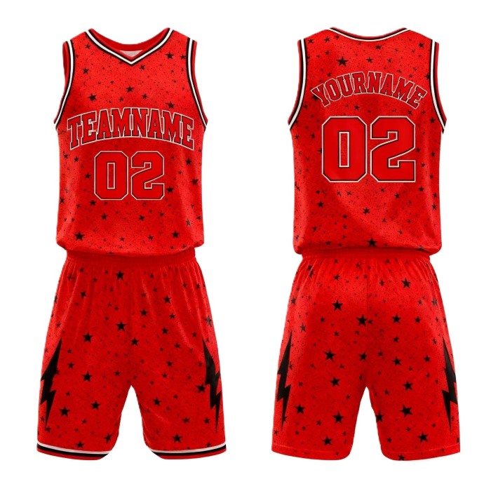
A digital proof shows layout. It does not show wash durability, and it only roughly shows color. Treat it as an approval for placement and nothing more. Colorfastness and color accuracy are separate questions, and each needs its own evidence.
| Request | What it can establish | What it cannot |
|---|---|---|
| Printed fabric swatch of the exact colors | Real color accuracy and gamut limits | Long-term durability |
| Wash-tested sample (wash it yourself, repeatedly, then compare to an unwashed piece) | Visible fade and bleed under your own care routine | Behavior under a different detergent or temperature |
| Written colorfastness terms | What the supplier will stand behind | Performance beyond the stated terms |
| Verified size chart with garment measurements | Fit consistency across sizes | Individual player preferences |
Our terms: free reprint for any printing defect or wrong size, and a 1-year colorfastness guarantee. Our facility holds ISO 9001 quality management and ISO 14001 environmental management certification. Those certifications describe the management system, not the result on any single order, so we still recommend the sample checks above.
Consider an illustrative case: a club wants a city-edition home and away set with a skyline graphic across the front panel, neon trim and a dark base. The practical path is sublimation on 100% polyester, 140-160 gsm, with numbers and names printed in the same pass so everything shares one color treatment. Neon trim is proofed on a physical swatch first. If it prints duller than expected, the team picks the closest achievable shade before bulk production, not after.
For a real reference point, we supplied 500+ sublimated jerseys for a US high school basketball league. We also produced full custom uniforms for an Australian soccer club’s three teams, and delivered 1000 event jerseys for a European marathon. Those cases show the same process handling both multi-team consistency and larger volumes. They do not mean every city-edition artwork will match its screen file exactly, which is why the swatch step stays in.
On volume and timing, there is no MOQ, though pricing depends on quantity. Five automatic dye-sublimation printing lines and 100+ workers give us capacity for 1000+ custom jerseys a day, and standard production runs 7-10 days, with rush orders available. Confirm timing against your artwork and quantity at quote stage.
The same specifications carry across the rest of your lineup, including custom team jerseys for other sports and volleyball uniforms built on the same fabric and print approach. Buyers extending a city theme to the soccer program can look at our soccer jerseys as well.
If you have your artwork and target quantity ready, send them with your color references and we will quote and arrange a printed sample before you commit to a full run.






 WhatsApp
 Email
 +8618978569271