Loading
Why does one city themed uniform feel like it belongs to the neighborhood, while another looks like a skyline stock image pasted on a tank top? The difference is rarely budget. A Vibrant City Edition Basketball Set works when every design cue has a job: color signals who you are, a landmark signals where you are, type signals the era, and a cultural reference signals why fans should care. This guide breaks down each cue, what it does in practice, and what goes wrong when it is specified badly.
I’m Linjing He. After 10 years in custom sportswear manufacturing, I’ve seen the same pattern in city edition basketball jerseys again and again. The concept is rarely the problem. Translating it into fabric is.
A local story is not a collage of everything your city is known for. It is one clear idea that a fan can read from the stands in about two seconds. Basketball uniforms are seen in motion, on camera, and from a distance, so the story has to survive scale, sweat and stretch.
Think of the jersey as four reading zones:
If you try to tell the story in all four zones at the same strength, none of them wins. Pick one lead zone and let the others support it. This does not apply if the set is a one-off event uniform where a full-body graphic is the point. Even then, keep the number clear.
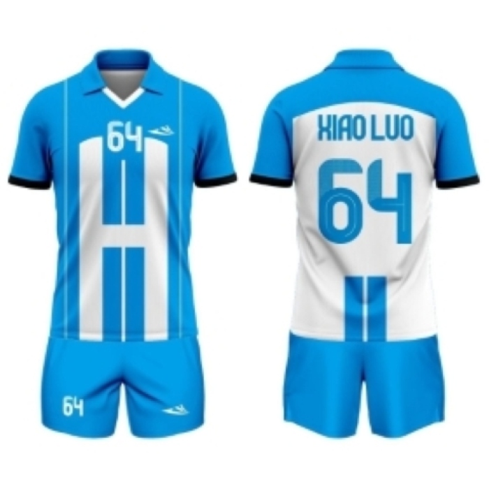
These local design cues carry different kinds of meaning. The table shows what each one communicates about team identity, how it is usually executed on a sublimated jersey, and the failure you get if the specification is wrong.
| Design cue | What it communicates | Best execution | What happens if you get it wrong |
|---|---|---|---|
| Colors | Instant belonging: harbor blues, brick reds, desert tones, sunset gradients tied to place | 2 to 3 core colors, with one accent reserved for trim and numbers | Five or more competing colors read as noise. Gradients with low contrast against the number make it unreadable on camera. |
| Landmarks | Geography and pride: a bridge, tower, skyline or street grid | Simplified line art or a tone on tone silhouette on the lower body or side panels | Photographic detail turns to mush at jersey scale. Placing it on the chest behind the wordmark hurts legibility. |
| Typography | Era and attitude: hand painted signage, transit lettering, vintage block type | A decorative face for the city name only; a clean, thick stroke face for numbers | Thin or ornate numbers lose clarity at distance. Referees and fans misread them in play. |
| Cultural references | Why the city matters: music, food, local slang, a neighborhood nickname, a historic date | One small, specific reference such as a nickname on the inner collar or a date on the hem | Overloading the jersey feels like a tourist souvenir. An inaccurate or borrowed reference can alienate the local fan base. |
For most clubs and retail lines, I rank them as colors first, typography second, landmark third and cultural reference fourth. Color is read from the farthest distance. A cultural reference rewards the fan who looks closely, so it works well as a detail and poorly as a headline.
The ranking changes for a retailer. A shop selling fan apparel may want the landmark more prominent, because it is what shoppers recognize on a hanger. A competitive team may keep the landmark quiet to protect number visibility.
A design that looks right on screen can fail in production. Here is what each parameter actually affects.
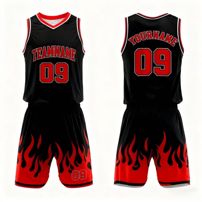
This is an illustrative scenario, not a customer case. Imagine a 12 player club in a port city. It wants custom basketball uniforms that nod to the waterfront.
What this avoids: a photo of the skyline across the chest, five accent colors, and an ornate number font. The result reads as local from the stands and stays legible on camera.
For real production context, we supplied 500+ sublimated jerseys for a US high school basketball league and produced full custom uniforms for an Australian soccer club’s three teams. Large multi design orders are routine for our line. Our factory in Guangzhou runs five automatic dye sublimation printing lines with 100+ workers.
For clubs that want to extend the theme, the same story can carry across a Custom Sport Jacket for warm ups, or across other sports programs such as a Volleyball Uniform set. If you are still comparing silhouettes, browse our Basketball Jerseys and the wider Custom Team Jerseys range for cut and fabric options.
A heavy local story is not always the right call. Leagues with strict uniform rules may limit patterns and color count. A one season club with a tight budget may be better served by a clean two color design with a strong wordmark. And if your fan base is regional, a niche reference that only a few people recognize will not help sales. Match the depth of the story to the audience.
Our facility is ISO 9001 and ISO 14001 certified, and daily output exceeds 1000 custom jerseys. We can review your concept, suggest the right fabric weight and flag print risks before anything is produced. Send us your city idea, color references and target quantity, and ask for a sample or proof recommendation to test your city edition concept before a full order.






 WhatsApp
 Email
 +8618978569271