Loading
You have a city, a mood board, and maybe a rough logo. The question is how to turn that into a basketball jersey and shorts that a factory can print, that players can move in, and that still reads as one uniform from the stands. A well-built Vibrant City Edition Basketball Set starts as a one-page spec, not a pile of references.
By the end of this guide you will have that spec: a locked color palette, one hero graphic, a typography plan, a placement map for jersey and shorts, and a production note sheet. It is written for teamwear designers and private-label buyers at the early concept stage, before artwork goes to a factory.
Starting point: a city theme, a rough idea of quantity, and nothing final on artwork. That is enough.
Some inputs block progress. Others can wait until the first proof. Sort them first so you do not stall on the wrong item.
| Input | Blocks the design? | Why it matters |
|---|---|---|
| Base color of the team or brand | Yes | Every other color is chosen relative to it. |
| Three to five city references (skyline, bridge, tile pattern, local signage) | Yes | You pick one hero from these. Without them, designs drift toward generic. |
| Logo files in vector format | Yes, before final art | Raster logos blur at jersey scale. |
| Estimated quantity and size split | No | Pricing depends on quantity, but there is no MOQ, so you can quote small and large runs. |
| Sponsor marks or league patches | No | Reserve the space now, confirm the artwork later. |
| Number and name font preference | No | Can be decided after the first layout. |
One fabric fact is worth settling now, because it shapes every graphic choice. Our basketball sets are 100% polyester, moisture-wicking, with 4-way stretch, at 140-160 gsm for breathability. Dye-sublimation prints go into the fabric rather than sitting on top, so large color fields stay soft and flexible. The trade-off: sublimation works best on light-colored polyester, so a pale base gives the most accurate color, and very dark bases need a test proof before you commit.
Choose a single city reference to carry the design. A bridge cable pattern, a skyline silhouette, or a tile motif all work. Everything else supports it. If you cannot name the hero in five words, you have more than one.
Checkpoint: show the sketch to someone unfamiliar with the brief. If they name the city or the theme within a few seconds, the hero is working. The most common failure is using three landmarks at once, which reads as a souvenir poster rather than a uniform.
Take a base color, a secondary color from the city source, and a neutral for outlines and numbers. Add one accent only for small details such as trim or a tag. This is a design rule of thumb, not a factory limit, because sublimation can print gradients. But restraint is what makes bold colors look intentional.
Checkpoint: print the palette as flat swatches on plain paper and place them next to each other. If two colors look close, drop one. Close shades often separate on screen and merge on fabric.
Use one display typeface for the city name or slogan and one clean block face for player numbers. Numbers must stay legible first. Decorative city lettering belongs on the chest wordmark or inside a side panel, not on the number.
Checkpoint: view the digital mockup at thumbnail size, or stand ten meters from a printout. The number should read instantly. If it does not, increase contrast between number fill and outline before touching anything else.
Divide each garment into zones: chest, back, side panels, hem on the jersey; left leg, right leg, waistband on the shorts. Assign one job per zone. Then repeat only a fraction of the jersey graphic on the shorts, such as a trimmed section of the pattern or the accent color band.
Write down the colors (with reference codes from your design file), the artwork zones, the font files, the size range, and the fabric. Attach your logos as vectors. This sheet is what you send for a quote and a proof.
This is where most city concepts fail. Designers try to show everything about a place on a single garment. The fix is a translation table: each city element gets one form and one location, and nothing appears twice at full strength.
| City element | Translate into | Jersey placement | Shorts placement | Clutter risk |
|---|---|---|---|---|
| Landmark (bridge, tower, skyline) | Simplified line or silhouette, one color | Tonal graphic across the lower front or side panel | Small cropped piece near the hem | Detailed illustration behind the number |
| Local colors (harbor blue, brick red, evening orange) | Base plus one secondary field | Large color block on body, secondary on side panels | Same base, secondary on a leg stripe | Using three or more secondaries |
| Street signage or tile pattern | Low-contrast repeat texture | Inside a shoulder yoke or side panel | Waistband or inner leg | Pattern running under numbers |
| City name or nickname | Display wordmark | Chest, single line | Left leg, small, or omit | Wordmark plus logo plus sponsor on chest |
| Local date or coordinate | Small tag detail | Back neck or hem | Waistband inside or outside | Making it large enough to compete with the number |
Two rules keep this under control. First, the number zone stays clean: no texture, no landmark detail directly behind it. Second, the shorts echo, they do not repeat. If the jersey shows the full skyline, the shorts show a color band or a fragment of it.
When this does not apply: if the buyer wants a fully all-over pattern design, with the pattern as the whole identity, then the hero is the pattern and the landmark moves to a small chest mark. Keep the same logic of one hero and one support.
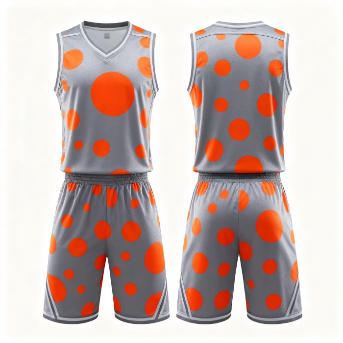
A concept becomes a product when the production notes are specific. Our factory in Guangzhou runs 5 automatic dye-sublimation printing lines with 100+ workers, and daily output exceeds 1,000 custom jerseys. Standard production takes 7-10 days, and rush orders are available. Your spec should make that timeline realistic, not stretch it with open questions.
Our facility holds ISO 9001 quality management and ISO 14001 environmental management certifications, which matters if your private-label client asks for supplier documentation.
For reference, we supplied 500+ sublimated jerseys to a US high school basketball league, and we produced full custom uniforms for an Australian soccer club’s three teams. Multi-team and mid-size orders like these are exactly where a clean spec saves proof rounds. Browse our Basketball Jerseys for base cuts, and our Custom Team Jerseys if the brief extends beyond basketball.
The design is ready for production when all five items below are true. This is the acceptance check, separate from any nice-to-have polish.
If a check fails, go back to the step that causes it:
| Symptom | Likely cause | Revisit |
|---|---|---|
| Design looks busy on the proof | Two or more heroes, or pattern behind the number | Step 1 and the placement table |
| Colors look muddy or too similar | Close shades in palette | Step 2 |
| Number hard to read | Weak contrast or decorative font on the number | Step 3 |
| Shorts feel disconnected | No shared element with the jersey | Step 4 |
| Printed color looks faded after washing | Unlocked or unverified inks, or a skipped proof | Spec sheet and proof stage; our 1-year colorfastness guarantee and free reprint for printing defects apply here |
If your concept is at the sketch stage, send your hero reference, base color, and rough quantity. We can review the spec sheet with you and quote a sample set before you commit to a full run.






 WhatsApp
 Email
 +8618978569271